
We were approached by Marketing Bees, based in the UK, to help with a design for a client of theirs. We were given the challenge of assisting with updating Warrington’s Own Buses vehicle branding on the new electric buses.
Warrington’s Own Buses
What we did
Industry
Public Transport
Description
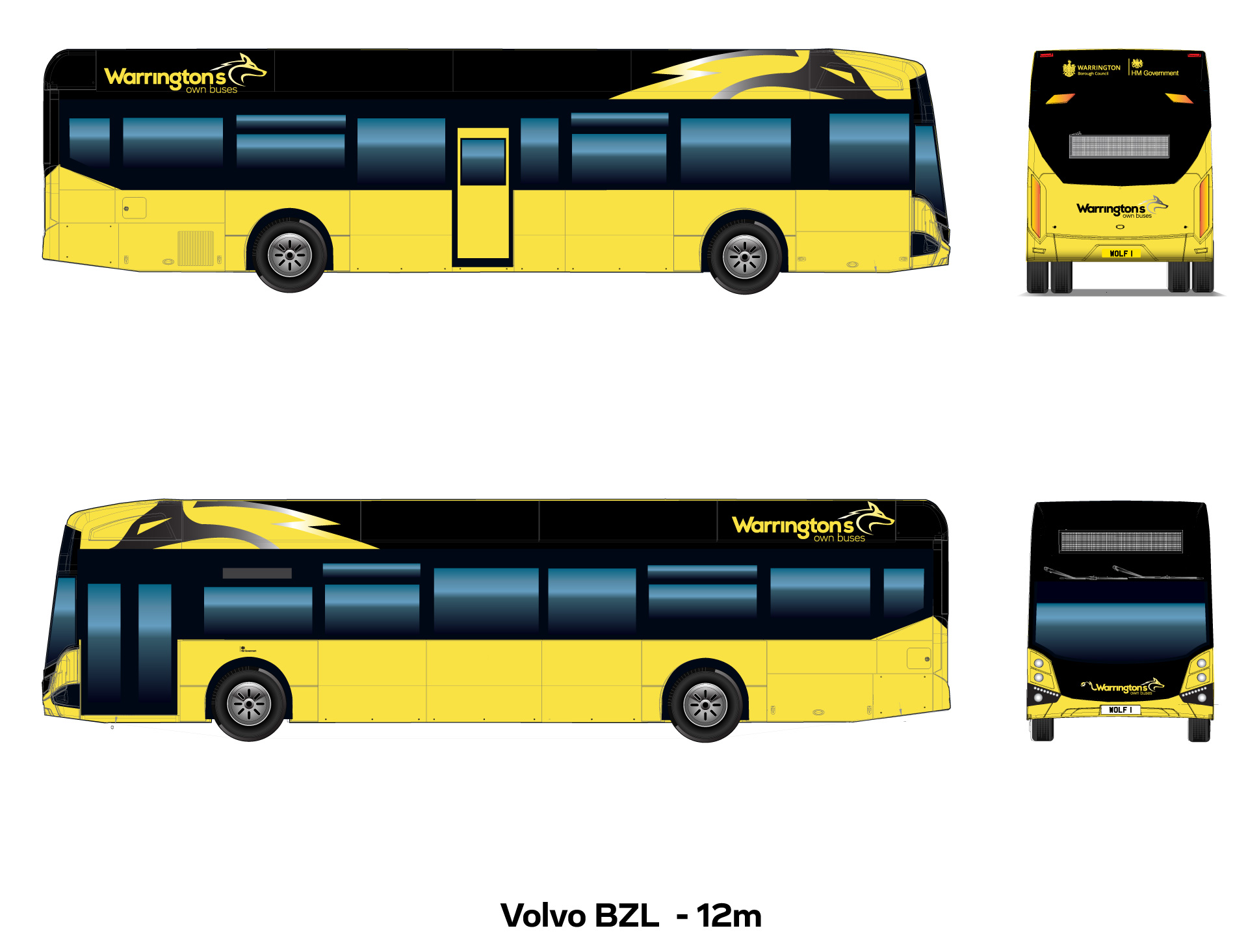
The new livery had to include the bright yellow as a base colour. We played with many colour combinations initially based on the original WOB’s logo but decided to create a colour palette of black and silvers to compliment the yellow instead. We therefore created a new version of the logo as well, which became a crucial part of the new bus livery. The wolf is a symbol for WOB, so we decided to use it to create a stand out feature for the livery. We feel the end design is very unique and eye-catching.
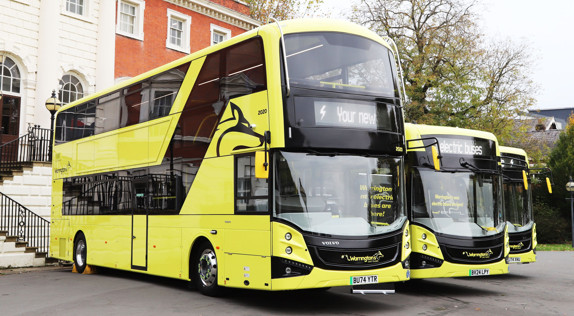
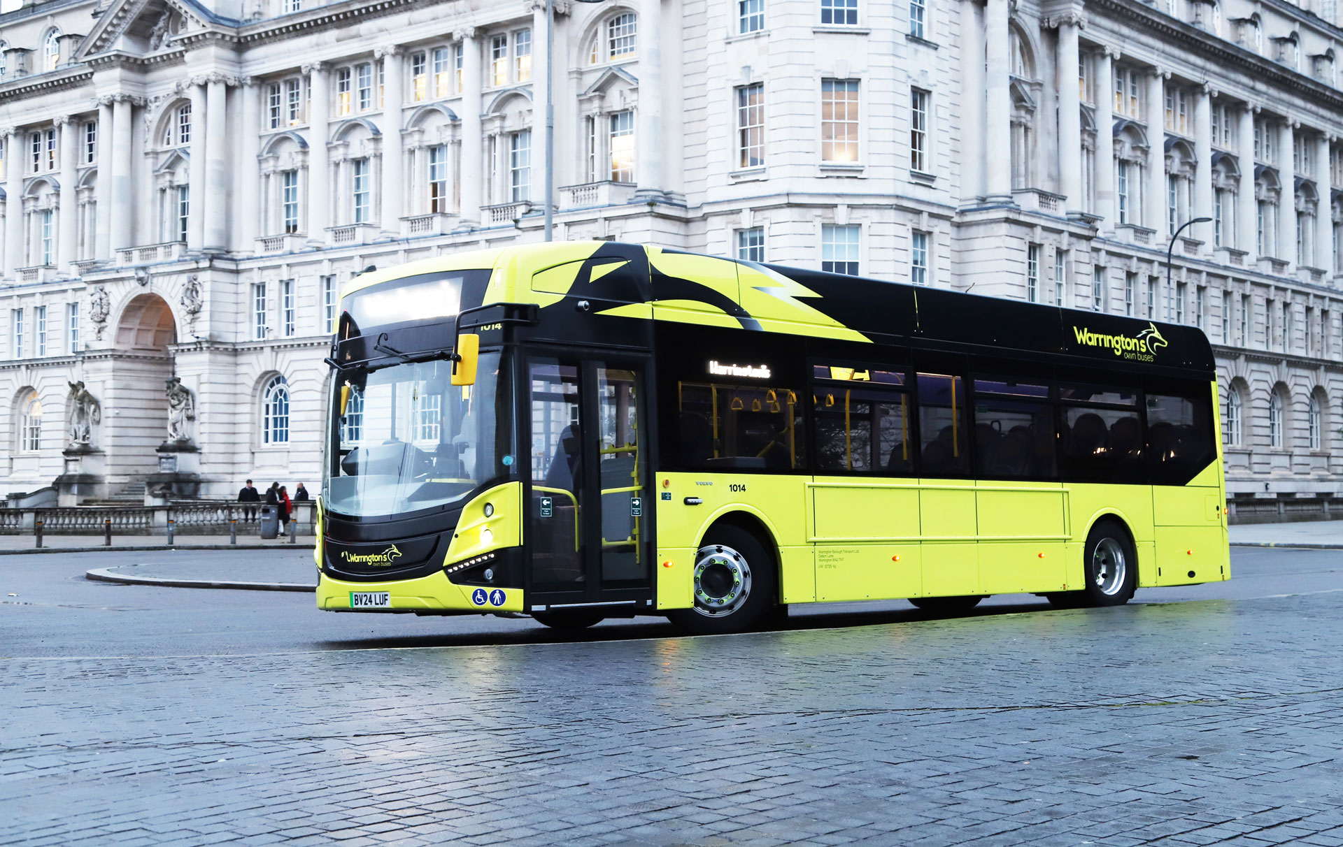
”Working with OYOO Design has been a fantastic experience from start to finish. When it came to launching our new fleet of electric buses, we knew the livery had to make a bold statement – not just about sustainability, but about the future of transport in Warrington. OYOO delivered exactly that. The team took the time to understand the need to use yellow as a base colour, as well as how important Warrington’s Own Buses is in the community and the importance of this step forward for the company. The final livery is a modern, vibrant, and now unmistakeably Warrington – a perfect representation of our commitment to a greener future. We’ve had fantastic feedback from passengers, the public and stakeholders, and we couldn’t be prouder of how the new buses look on the road. A huge thank you to everyone at OYOO for helping bring our vision to life.
Hannah MorrisMarketing and Commercial Manager


